
 05:41
05:41
 artzz.luv
The dodge tool lightens the pixels you paint, and the burn
tool darkens the pixels you paint. It’s not entirely different from
using Levels or Curves. The difference is that you are not applying the
changes to the entire image; you’re applying them only to the places you
paint with the brushes. Think of it as a way of selectively adjusting
the brightness or darkness of your image.
I almost never use the burn tool, and I rarely use the dodge tool for tone control. My preferred technique for that is coming up shortly. Having said that though, there are times when the dodge tool is an enormous help to my work as a photographer.
We are often asked to photograph things or people on a white background, so the image can be placed on a white page. The client doesn’t want a light background — they want a white background! Often it is just plain impossible to get a pure white background without ruining the subject matter. Imagine a white shoe, or a shiny metal part. You just can’t photograph subjects like these on a pure white background; the photographer needs to light for the product and then deal with the background later.
The dodge tool, set to “highlights” and applied with a large, soft brush, is often the fastest and easiest way to get the area immediately surrounding the product to white. After that it’s simple to grab the rest with the lasso and fill with white. Here are two examples:
[photo of lock nut courtesy JKMabry.]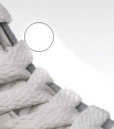
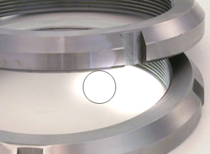
It’s even easier when the subject is dark. Since we can’t always photograph three dimensional subjects without shadows, we often have to get rid of them later. Since the dodge tool can be set to ignore dark things you don’t even have to be that careful! Truly a useful tool for a photographer.
You can use these tools to improve your images in several different ways:
Range: The range determines which pixels will be affected, and is probably the most important and most often neglected setting. Muy importante.
As a rule of thumb, you will most often use the “highlights” setting
for the dodge tool, and the “shadows” setting with the burn tool.
Exposure: In most applications, the key to effective dodging and burning is subtlety. If you create the effect you’re after without allowing the viewer to detect the changes, the image will have far more impact. For this reason, I suggest setting your exposure to only 3-5% and use repeated sweeping movements over the area you are trying to affect. It makes the changes far more gradual and harder to detect; it also requires a little patience. It’s slow, but it works. I promise. Put on some music or something to help pass the time.
Brush: The size of the brush you should use will vary based on
the size of the area you are working on. In general a larger brush with
softer edges (hardness +/-50%) will make for more subtle transitions.
Colour vs Grayscale: These techniques tend to work better on
grayscale images than they do on colour ones. Applied excessively to a
colour image, dodging tends to wash out the colours, and burning tends
to make for obvious grey blotches. There are certainly exceptions to
this rule, but I think it’s a fair generalization.
Notice the whites aren’t really white, and the blacks aren’t really
black. I selected the Dodge tool, set the Range to ‘highlights’, and
exposure to 3%. I took a brush about ½ the size of his head (which,
incidentally is a pretty huge noggin), and brushed the areas that needed
lightening. I focused on the important parts of this shot - his face,
his smile, the detail on his jacket). The dodge tool is also great for
lightening dark circles under the eyes of groomsmen who stayed out too
late drinking the night before the wedding.
Next, I switched to the Burn tool (*cool trick alert: hitting Shift+O toggles between dodge and burn) and set the Range to Shadows. Again, I painted over the parts of the photo that should be darker, going gently on his face to avoid harsh shadows; they can make noses bigger and wrinkles deeper and other ghastly stuff. I lost some detail in his jacket, but don’t consider that an issue; in fact it likely shifts your attention more to his face, which makes for an unintentional yet timely segue to the next application.
Create custom birthday party invitations
The image on the left is fairly evenly exposed, and about how the
lighting appeared in real life. Under normal circumstances I’d have
included much of the background; it’s a bit unusual and quirky, but fun
(sorta like me J). But in this case we needed the model to be the focal
point, and I felt the background detracted from her. I removed some of
the distracting elements of the photo by burning them into shadows (I
did no cloning whatsoever). The intent was to make it look as though
the shadows and highlights were created by the lighting, not by post
processing. I figured this meant I had to try to create the illusion of
a single light source. Anything that didn’t fall in the path of that
imaginary light source was burned. In this case I actually burned some
midtones as well for a more balanced effect. The net result is a very
clear focal point with fewer distracting elements. Again only dodge and
burn tools were used to edit the grayscale image.
Not a magnificent photo by any stretch, but a competent illustration
of how you can change the impact of a photo with dodging and burning.
Cloudy day, flat lighting, shooting towards the sun; ideal conditions if
you like really flat, low-contrast photos (*yawn*). I set the Ranges
the same as I did in the first example, but I cranked the exposure up to
9% instead of 3%. Notice how when applied to the right places, a good
amount of detail is recovered and emphasized. Specifically note the
detail in the grain of the wood on the light post. Suddenly the photo
has depth and texture. Heavy burning in the clouds gives the sky an
ominous and looming presence, which is something that wasn’t there in
real life.
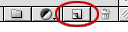 Create
a new layer in “overlay” mode. The easiest way is to option click (alt
click if you use a PC) on the New Layer icon at the bottom of the Layers
palette.
Create
a new layer in “overlay” mode. The easiest way is to option click (alt
click if you use a PC) on the New Layer icon at the bottom of the Layers
palette.
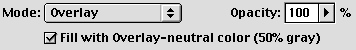 In
the dialog that will appear, choose “Overlay” from the popup menu, and
check the option to fill it with 50% gray (the overlay "neutral" color.)
Paint on this layer with all the controls the brush tool offers you.
Paint with a gray lighter than 50% and it “dodges” — the closer to white
the stronger the dodge effect; paint with a gray darker than 50% and it
“burns” — the closer to black the stronger the burn effect. Don't like
what you did? Paint with 50% and it erases the effect. Lower the opacity
of the overlay layer to finesse your work. This is control like you
wouldn't believe. Want to “burn” the edges so the viewer’s eyes are
drawn into the image? Make a selection, feather it heavily, inverse the selection, fill with a darkish gray and fine tune to taste.
In
the dialog that will appear, choose “Overlay” from the popup menu, and
check the option to fill it with 50% gray (the overlay "neutral" color.)
Paint on this layer with all the controls the brush tool offers you.
Paint with a gray lighter than 50% and it “dodges” — the closer to white
the stronger the dodge effect; paint with a gray darker than 50% and it
“burns” — the closer to black the stronger the burn effect. Don't like
what you did? Paint with 50% and it erases the effect. Lower the opacity
of the overlay layer to finesse your work. This is control like you
wouldn't believe. Want to “burn” the edges so the viewer’s eyes are
drawn into the image? Make a selection, feather it heavily, inverse the selection, fill with a darkish gray and fine tune to taste.
I almost never use the burn tool, and I rarely use the dodge tool for tone control. My preferred technique for that is coming up shortly. Having said that though, there are times when the dodge tool is an enormous help to my work as a photographer.
We are often asked to photograph things or people on a white background, so the image can be placed on a white page. The client doesn’t want a light background — they want a white background! Often it is just plain impossible to get a pure white background without ruining the subject matter. Imagine a white shoe, or a shiny metal part. You just can’t photograph subjects like these on a pure white background; the photographer needs to light for the product and then deal with the background later.
The dodge tool, set to “highlights” and applied with a large, soft brush, is often the fastest and easiest way to get the area immediately surrounding the product to white. After that it’s simple to grab the rest with the lasso and fill with white. Here are two examples:
[photo of lock nut courtesy JKMabry.]
It’s even easier when the subject is dark. Since we can’t always photograph three dimensional subjects without shadows, we often have to get rid of them later. Since the dodge tool can be set to ignore dark things you don’t even have to be that careful! Truly a useful tool for a photographer.
You can use these tools to improve your images in several different ways:
- To improve the exposure of your photo and bring out detail
- To direct your viewers attention through creative use of highlights and shadows
- To create impact by adding dramatic highlights and shadows
Range: The range determines which pixels will be affected, and is probably the most important and most often neglected setting. Muy importante.
 |
|
Exposure: In most applications, the key to effective dodging and burning is subtlety. If you create the effect you’re after without allowing the viewer to detect the changes, the image will have far more impact. For this reason, I suggest setting your exposure to only 3-5% and use repeated sweeping movements over the area you are trying to affect. It makes the changes far more gradual and harder to detect; it also requires a little patience. It’s slow, but it works. I promise. Put on some music or something to help pass the time.
 | *As a side note, I tend to also select the ‘airbrush’ option (that little thingy right beside exposure in this picture). It seems to give a little more natural result. No idea why. But really, does it matter why? I didn’t think so. If it does matter to you... you could look it up. Then you could tell me. |
 |
Application 1: Improving Exposure
In this example the original image was underexposed and really flat looking (i.e., very little contrast). Normally I’d start the process using curves, but for the sake of the example all edits will be done with dodge and burn. Here is how I rescued it: |
Next, I switched to the Burn tool (*cool trick alert: hitting Shift+O toggles between dodge and burn) and set the Range to Shadows. Again, I painted over the parts of the photo that should be darker, going gently on his face to avoid harsh shadows; they can make noses bigger and wrinkles deeper and other ghastly stuff. I lost some detail in his jacket, but don’t consider that an issue; in fact it likely shifts your attention more to his face, which makes for an unintentional yet timely segue to the next application.
Create custom birthday party invitations
Application 2: Directing the Viewers Attention
This is my favourite, and perhaps the most elusive use of dodging and burning. When it’s applied well, you won’t even know it’s been done. Consider the following example: |
Application 3: Adding Impact with Light and Shadow
Discussions about dodging and burning often revolve around this application of the technique. It generates all kinds of debate about what violates photographic integrity and what crosses into the realm of ‘digital art’. I’m not going to express an opinion about that; rather I’ll try to demonstrate how it’s done and leave that debate for somebody else who enjoys things like pushing water uphill with a fork. |
Overlay Advantages
In
the dialog that will appear, choose “Overlay” from the popup menu, and
check the option to fill it with 50% gray (the overlay "neutral" color.)
Paint on this layer with all the controls the brush tool offers you.
Paint with a gray lighter than 50% and it “dodges” — the closer to white
the stronger the dodge effect; paint with a gray darker than 50% and it
“burns” — the closer to black the stronger the burn effect. Don't like
what you did? Paint with 50% and it erases the effect. Lower the opacity
of the overlay layer to finesse your work. This is control like you
wouldn't believe. Want to “burn” the edges so the viewer’s eyes are
drawn into the image? Make a selection, feather it heavily, inverse the selection, fill with a darkish gray and fine tune to taste.
Enjoy
Artzz Luv
 Posted in


0 comments :
Post a Comment